Go Active
2020
User Research
UI/UX
Web Development
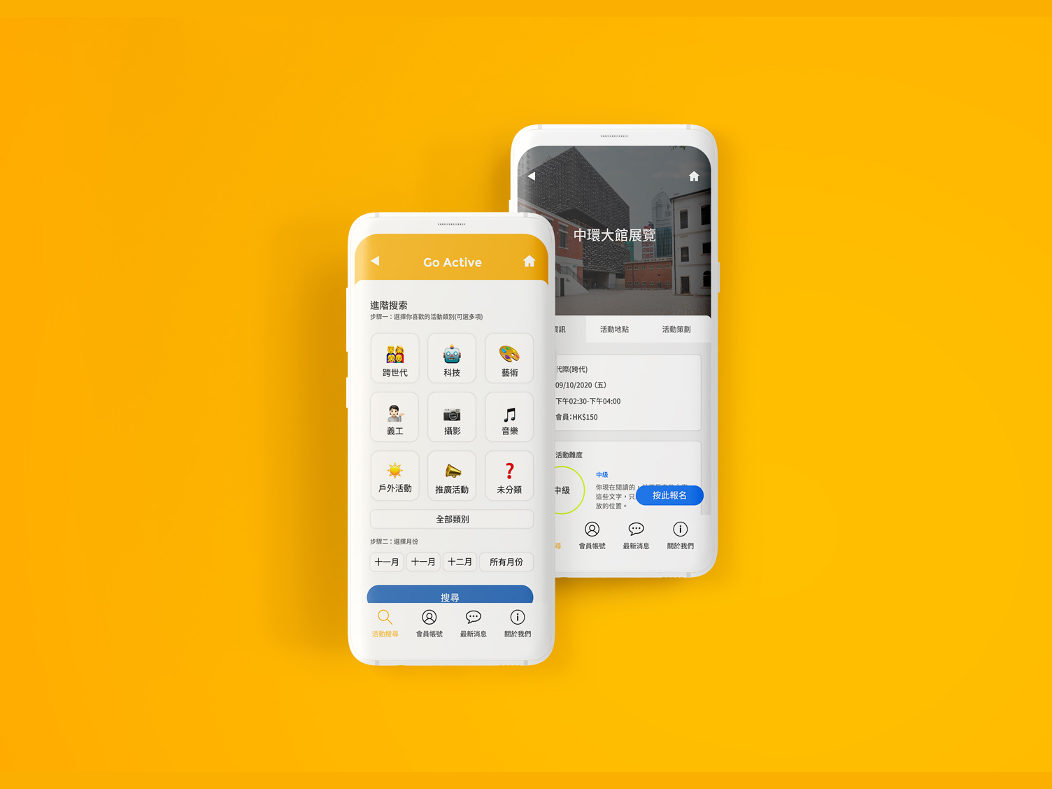
Go Active is an online event registration platform to promote Active Ageing. It is specially designed for users over 60 years old.
The platform was designed and developed for HKSKH Lady Maclehose Centre with the support of JCDISI (Jockey Club Design Institute for Social Innovation). Go Active enables the users to stay updated on the latest events organized by the Center and register without the need to visit the Centre periodically.
A Platform for our "Young Old" Generation
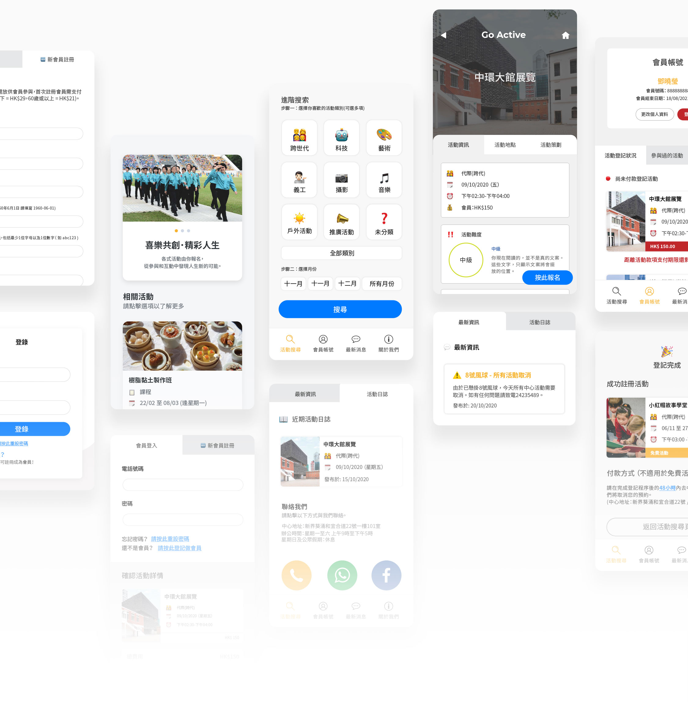
From color legibility, copywriting to information layout, every detail was designed based on the users' needs.
A Co-created Platform
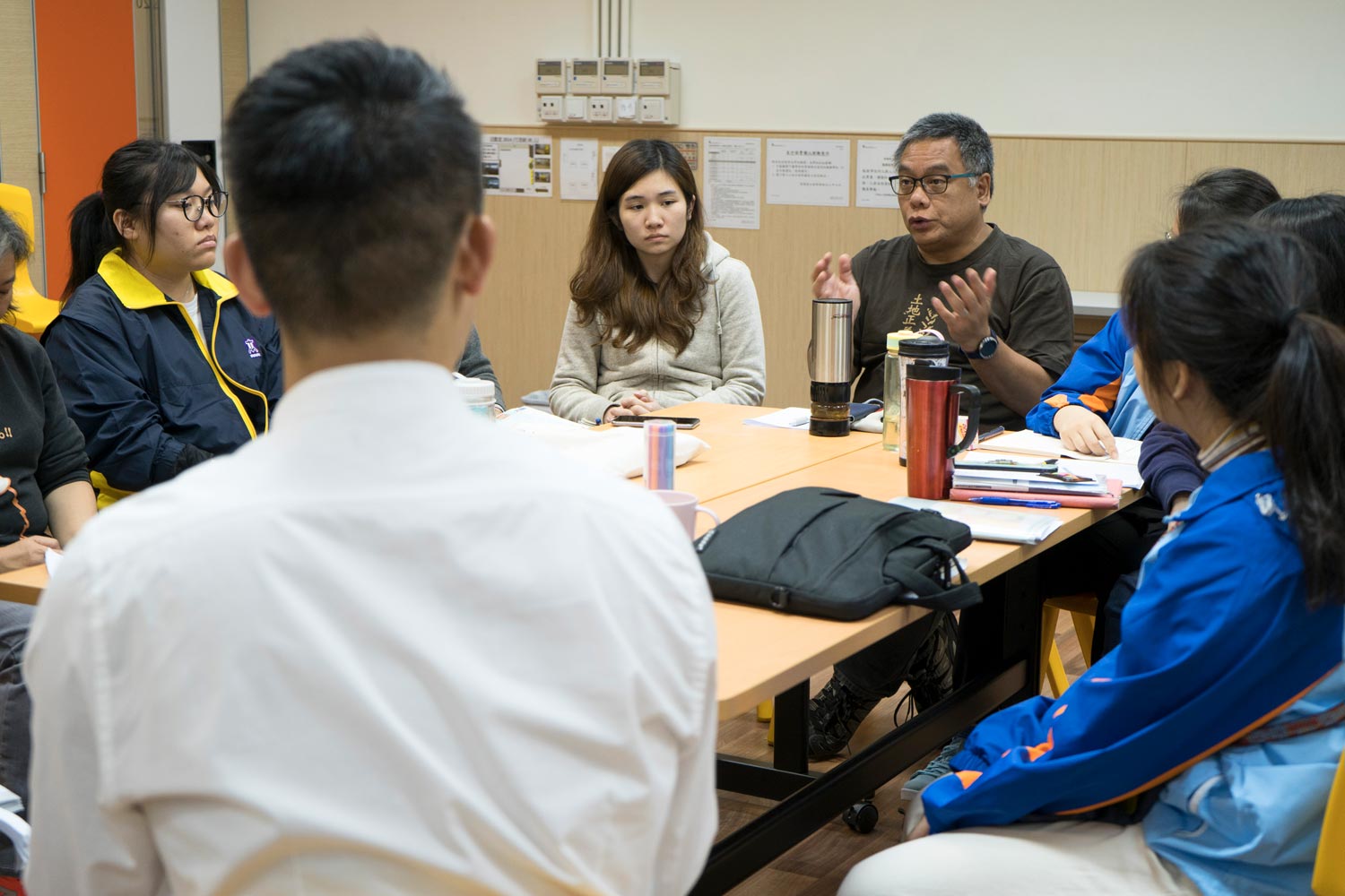
Go Active has been crafted with a comprehensive user-centric approach, multiple user engagements, and workshops were carried out to build a system that truly works for our end users - center's members and staff.
Design Thinking and User Engagement Workshops
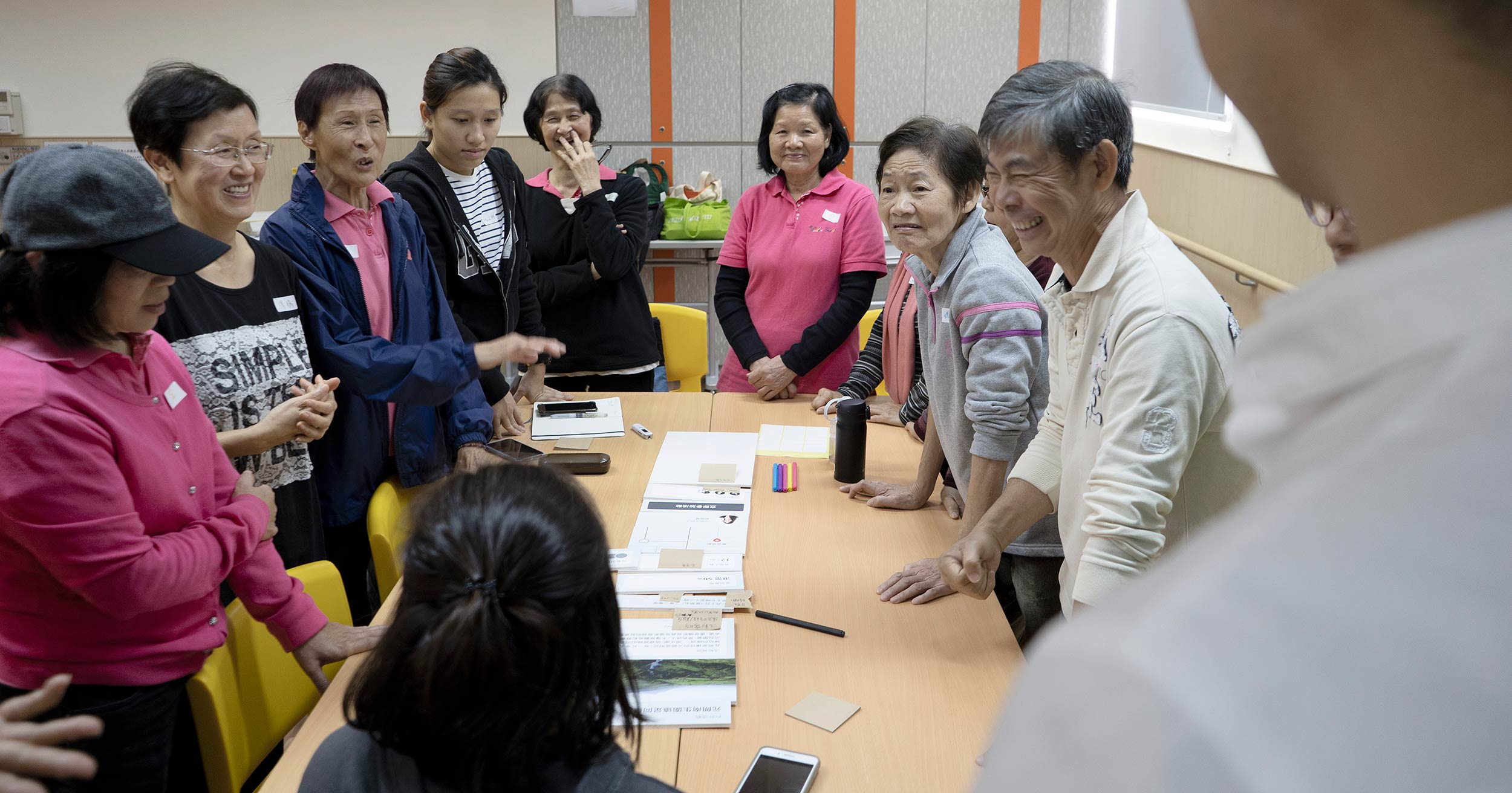
Getting to know the target-end users and identifying their pain points, behavior, and habits when using the phone or creating events was our priority.
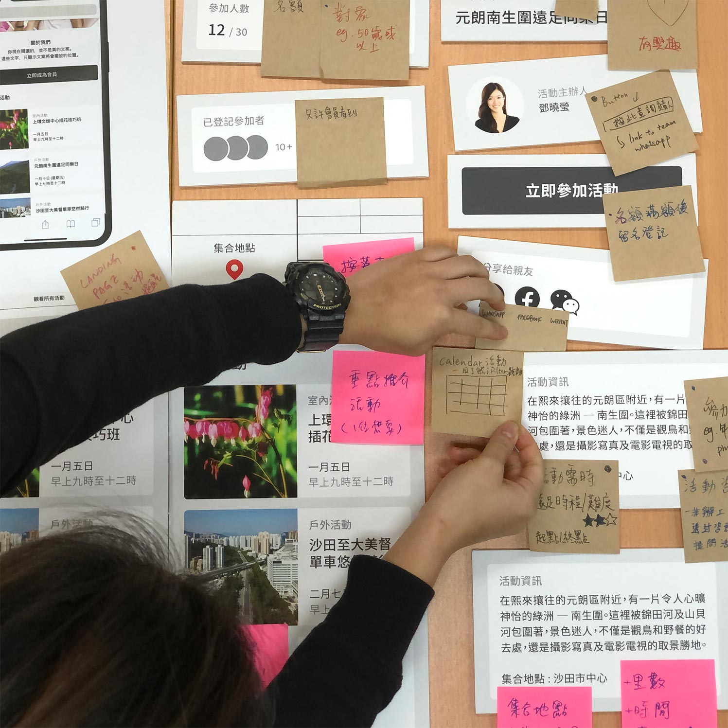
Multiple support tools were designed to conduct the workshops - from questionnaires, paper phone cutouts to blown-up foam boards.
Staff Workshops
GoActive is also a platform designed for the center's staff (especially the backend). If the staff does not feel comfortable using the back-end, the platform would not be sustainable in the first place.
Design & Development
Since the first user flow and wireframe to the current version, tens of design iterations were made and improved over time through user feedback and testing.
Below is a snippet of some of the design considerations based on all the user engagement workshops. If you are interested to know more, please reach out. We have an extensive user-research document on "designing a web/app platform for our 'young' olds".
Center's Value
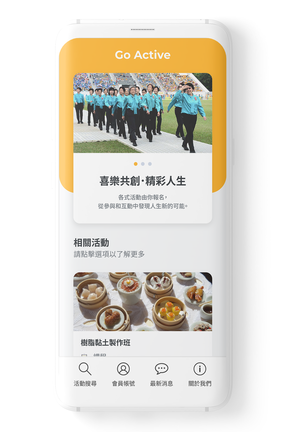
From our workshops with non-members over 60 years old, they emphasized the importance of the center's values being the first touchpoint when entering the platform. They believe that if their values do not align, it's easy to lose interest.
The platform uses "cards" as its main visual identity - the cards are usually split into halves, pictures at the top and content at the bottom. This helps to minimize the staff's responsibility to find the “right” picture all the time - the same color tone, style, etc. Yet allowing the platform to still look visually consistent. This can help reduce the staff's workload and maximize their time to do the things that are important.
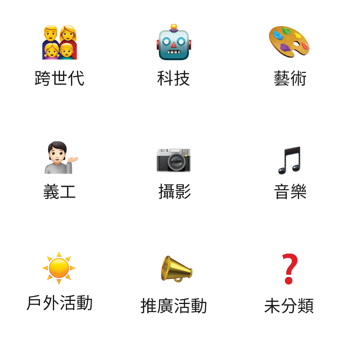
Emojis for Easy Maintenence
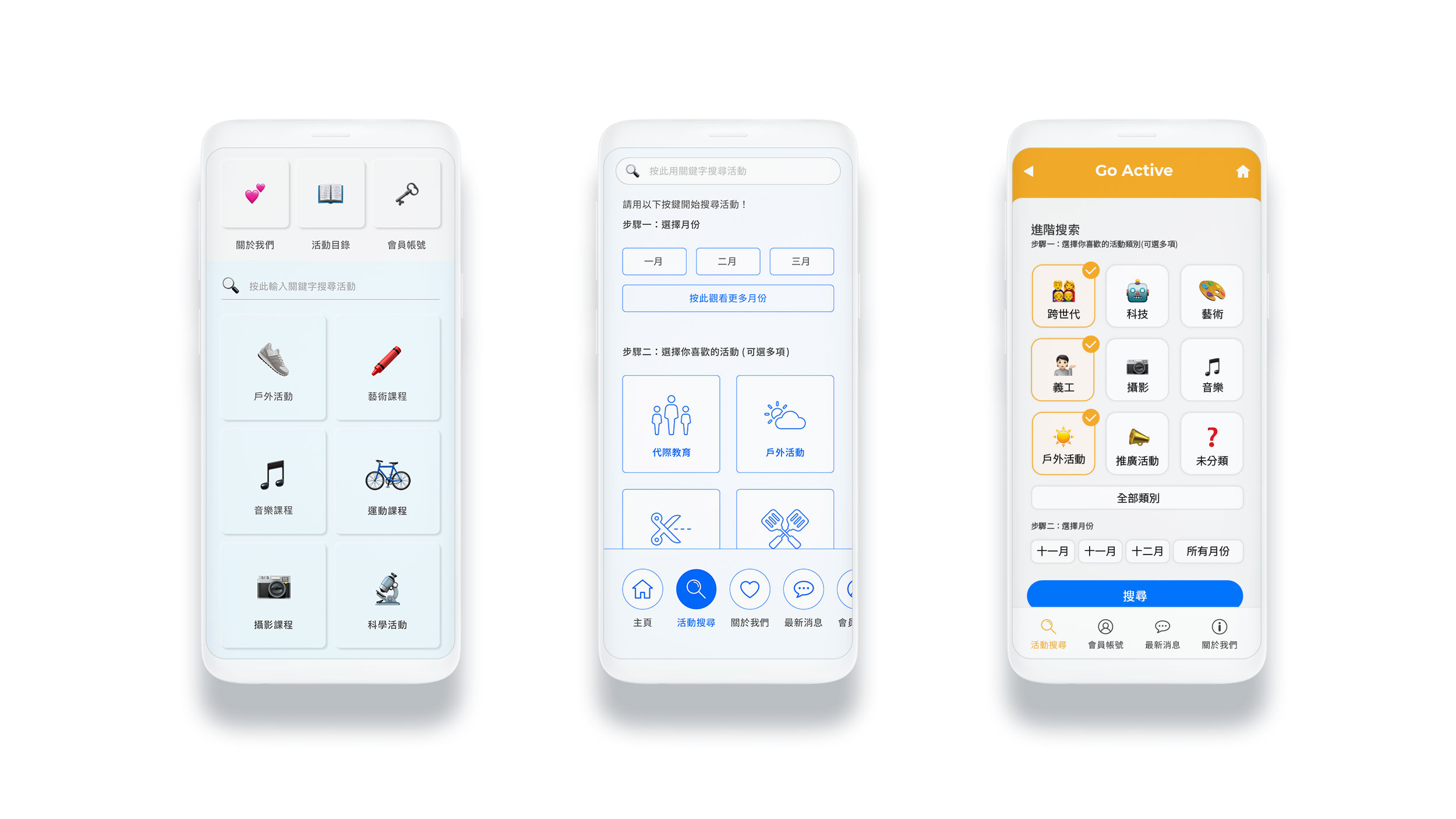
From our research, we found that over 90% of our target end-users are proficient with WhatsApp. Additionally, as an event registration platform, it was inevitable that the center would eventually develop an event category that does not have an icon prepared by us.
For maintenance and ease of use, we decided to use emojis - a universal language our users are familiar with and with an extensive library guaranteed for the staff to find something relevant for future use.
Feel free to reach out to hello@studiodoozy.com if you would like to know and read more about our extensive research on designing a platform for our 'young' olds (users over 60 years old)!
What's Next?
Contact
#502, 5/F, 1 Hung To Road
Kwun Tong, Hong Kong
Phone: +852 9794 4792
Email: hello@studiodoozy.com
